Table of Contents
ToggleHanging family photos is one thing, making them look intentional is another. Walk into any home, and you’ll spot the difference immediately: mismatched frames, clashing clothing colors, and photos that fight against the wall color instead of complementing it. The result? A wall that feels chaotic instead of curated. Color coordination isn’t about being precious or following rigid design rules. It’s about creating visual harmony so your family photos enhance your space rather than distract from it. Whether you’re planning a new photoshoot or working with existing prints, understanding color schemes for family photos will help you build a display that feels polished and professional without hiring a designer.
Key Takeaways
- Family photo color schemes create visual harmony and a polished focal point by coordinating frames, clothing, and wall colors, making your display look intentional and professionally curated.
- Neutral tones, monochromatic palettes, and matching frame finishes are timeless color schemes that complement any decor style and protect your investment in professional photography.
- Plan clothing coordination before your photoshoot by selecting one base color and two to three complementary accents, avoiding neon tones, logos, and overly bold patterns that compete for attention.
- Match your photo frames and matting to your room’s wall color, existing furniture finishes, and lighting conditions—light walls offer flexibility while dark walls require lighter frames to prevent photos from disappearing.
- Establishing a cohesive color palette for family photos simplifies future updates and swaps, allowing you to add new prints without starting your display from scratch.
Why Color Coordination Matters for Family Photo Displays
Your eye naturally seeks patterns and cohesion. When colors in a photo display clash, whether it’s frame finishes, matting, clothing, or the wall color itself, your brain registers it as visual noise. That’s not subjective design talk: it’s how human perception works.
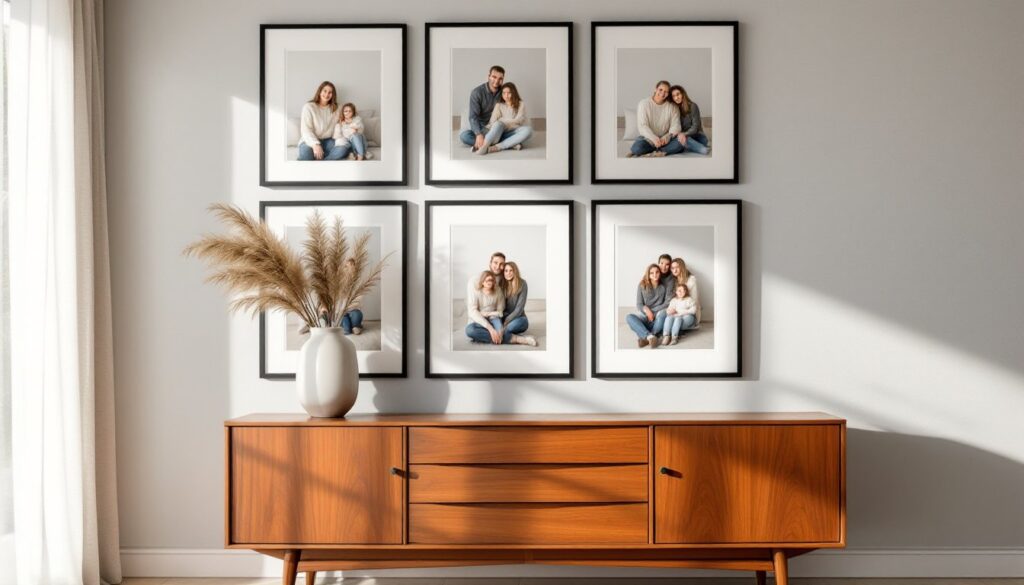
Coordinated large family photo color schemes create a focal point instead of scattered attention. When frames share a finish (all black, all natural wood, all white), your eye moves smoothly across the grouping. When clothing colors in the photos themselves follow a palette, the images feel like a collection rather than random snapshots. This matters especially in high-traffic areas like hallways, living rooms, and stairwells where the display becomes part of the room’s architecture.
Color coordination also protects your investment. Professional photo sessions aren’t cheap, and neither are quality frames and prints. A well-coordinated display looks intentional and expensive. A poorly coordinated one, even with the same budget, looks haphazard. If you’re spending money on family portraits, spend fifteen minutes planning the color scheme before you book the photographer or order frames.
Finally, coordination simplifies future updates. When you establish a color palette, adding new photos or swapping out prints becomes straightforward. You’re not starting from scratch every time: you’re working within a system that already functions.
Classic Color Schemes That Never Go Out of Style
Certain palettes have staying power because they work with multiple decor styles and don’t date quickly. These aren’t trendy, they’re foundational.
Neutral Tones for Timeless Elegance
Neutral palettes (blacks, whites, grays, beiges, taupes) are the workhorses of family portrait color schemes. They pair with virtually any wall color, from builder-grade beige to bold accent walls. For frames, black or natural wood tones in walnut or oak provide contrast without competing. White or cream mats inside the frames add breathing room around the photo and keep the focus on faces.
When planning clothing for a neutral-toned photoshoot, layer textures instead of relying on color variety. Think cream cable-knit sweaters, gray linen shirts, and dark denim. The result feels cohesive without looking like a uniform. Neutral schemes also age well, what works in a farmhouse-style home translates easily to a modern or traditional space if you move.
One caution: all-neutral doesn’t mean all-boring. Vary the tones, pair cool grays with warm taupes, or mix black frames with lighter matting. Flat, one-note neutrals can read as sterile. Depth comes from contrast within the neutral range.
Monochromatic Palettes for Modern Impact
A monochromatic scheme uses variations of a single color, different shades, tints, and tones. For family photos, this often means multiple shades of blue, green, or even sepia-toned black-and-white prints. According to color psychology principles, monochromatic displays feel cohesive and sophisticated because they eliminate color conflict entirely.
In practice, this might look like navy, sky blue, and pale blue clothing in your photos, paired with gray or white frames. Or sepia-toned prints in matching dark wood frames. The monochromatic approach works especially well in minimalist or contemporary interiors where bold color would clash with clean lines and neutral furnishings.
Monochromatic doesn’t require black-and-white photography, though that’s an easy win. You can shoot in color and convert selectively, or plan clothing around a single hue family during the photoshoot. Either way, the lack of competing colors creates a gallery-like effect that elevates even casual family snapshots.
How to Choose Colors Based on Your Room’s Decor
Your photo display isn’t floating in a vacuum, it’s hanging on a specific wall in a specific room with existing paint, furniture, and finishes. Ignoring that context is how you end up with frames that disappear or photos that clash.
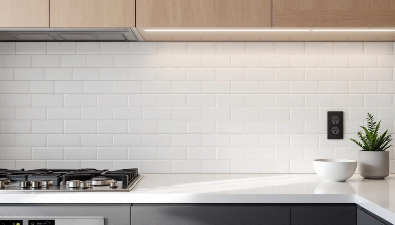
Start with your wall color. Light walls (white, cream, light gray) give you the most flexibility. Nearly any frame color works, though black creates the strongest contrast and natural wood adds warmth. Dark walls (navy, charcoal, deep green) call for lighter frames or thick white mats to prevent photos from vanishing into the background. Many interior design experts recommend testing frame samples against your actual wall before committing to a dozen matching frames.
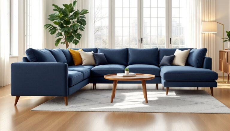
Next, consider existing furniture and trim. If your baseboards, door frames, and window casings are white, white or light wood photo frames will tie into that architecture. If you’ve got dark wood furniture or espresso-stained built-ins, echo that tone in your frame selection. Matching the undertone (warm vs. cool) matters more than exact color matching, warm honey oak frames pair better with warm beige walls than with cool gray walls, even if the values are similar.
For accent colors in your room (throw pillows, rugs, artwork), you can either echo them subtly in your photo display or stay neutral to avoid competition. If your living room features a bold teal accent wall, consider whether your family photos should incorporate teal clothing or stay neutral to balance the room. There’s no single right answer, but the decision should be intentional.
Finally, think about lighting. Rooms with abundant natural light can handle darker frames and bolder color contrasts. Dimly lit hallways or north-facing rooms benefit from lighter frames and high-contrast matting to keep photos visible and inviting.
Seasonal and Themed Color Schemes for Family Photos
Seasonal and themed palettes add personality and can be swapped out as your tastes change, provided you plan for it from the start.
Fall/autumn palettes lean into warm tones: rust, mustard, olive, burgundy, and cream. These work beautifully in homes with wood floors, brick fireplaces, or warm-toned paint. Plan clothing around layered textures, flannel, corduroy, knit scarves, and pair the prints with natural wood frames or matte black for contrast. This palette particularly suits homes decorated with rustic or farmhouse touches, where warmth and texture are prioritized over sleek minimalism.
Winter schemes favor cool tones: icy blues, silvers, grays, and crisp whites. These pair well with modern or Scandinavian interiors. Black-and-white photography fits naturally here, as do metallic or brushed nickel frames. If you’re shooting holiday photos, resist the urge to go full red-and-green unless that’s a wall you’re willing to commit to year-round.
Spring/summer palettes incorporate pastels or brighter tones, soft pinks, sky blues, mint greens, and sunny yellows. These feel lighter and work in spaces with lots of natural light or coastal/cottage decor styles. White or light natural wood frames keep the look airy.
For themed displays (anniversary photos, vacation series, generational portraits), your color scheme can echo the setting. Beach photos pair with blues and sandy neutrals: mountain cabin shots call for forest greens and earth tones. The key is consistency within the grouping, if one photo breaks the palette, it’ll stand out for the wrong reasons.
One practical note: if you plan to rotate seasonal displays, invest in a consistent frame style and size upfront. Swapping 8×10-inch prints in matching frames twice a year is manageable. Re-framing an entire wall gallery isn’t.
Coordinating Clothing Colors for Photoshoot Success
The best frame and matting choices can’t fix a photo where half the family wore neon and the other half wore black. Clothing coordination happens before the shutter clicks, and it’s the single most impactful decision for cohesive family photo color schemes.
Start by choosing one base color that everyone incorporates, this could be denim, white, gray, or khaki. Then select two or three accent colors that complement each other and your intended display space. For example: base of dark denim, accents of cream and dusty blue. Or base of khaki, accents of olive and rust. Avoid matching everyone exactly (that reads as dated), but keep the palette narrow.
Patterns and textures add visual interest without breaking the color scheme. Small-scale patterns, thin stripes, subtle plaids, fine knits, photograph better than large, bold prints that compete for attention. Make sure patterns share at least one color with the base palette.
Avoid these common mistakes: too many colors (more than four gets chaotic), overly bright or neon tones (they dominate the frame), logos or graphic text (they date photos instantly), and everyone wearing the exact same item (e.g., all white t-shirts). Also skip all-black unless you’re going for a formal, editorial look, it can feel heavy and harsh in a home setting.
For large family groups, assign color “zones” by household or branch of the family tree. One family unit wears shades of blue and gray, another wears cream and olive. This creates visual organization within the photo and helps guide the viewer’s eye across the composition.
Finally, coordinate with your photographer about the shooting location and backdrop. If you’re shooting outdoors in a field of golden grass, warm earth tones will blend beautifully. If you’re in front of a white wall, you have more flexibility but should avoid colors that wash out (very pale pastels can disappear). Bring clothing samples or photos to your planning session so the photographer can flag potential issues before shoot day.
Plan ahead, keep the palette tight, and prioritize timelessness over trends. Your family photos should still look good on your wall in five years, not like a snapshot of a single season’s fashion moment.